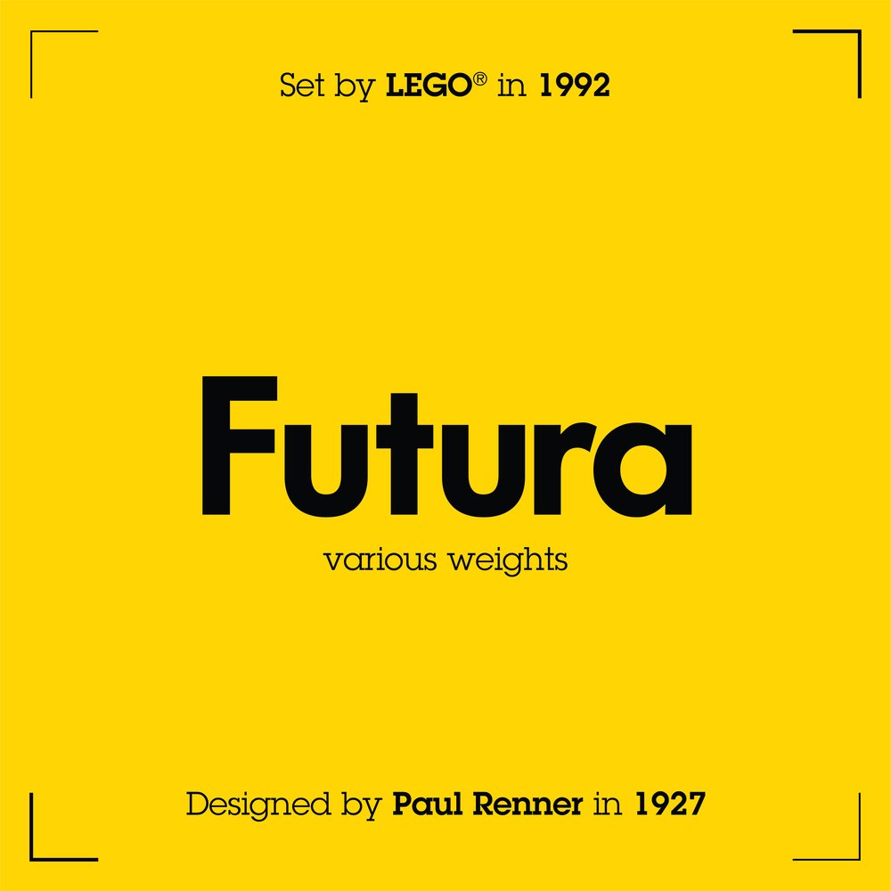
Welcome back to All Types, a look at the typography of LEGO. This time around, we’ll travel back through time from the beginning of the 90s all the way to the 60s. This round of typefaces seems to have some commonality—but stick around ‘til the end where I look at a very funky personal favourite! For readers who haven’t seen the previous entry in this mini-typographic deep dive, go and check it out! For those of you who have, this time around I’ve attempted to credit the designers responsible for the typefaces shown. They all have their own equally rich history that should be remembered. Futura - 1992 Basic Range Futura, my guilty love, showed itself in box art. It had been used previously in this same Basic range but I chose to focus on the first sets with the System graphic, an iconic feature of this age. Futura is the...

