
The Conversation Piece #5: How to Use Color in LEGO Builds

“The Conversation Piece” is a monthly BrickNerd series about creativity and building with LEGO authored by our friends over at the Builder Improvement Initiative (BII), a Discord-based community that helps LEGO builders of all levels get better at their craft through knowledge-sharing and constructive feedback.
Have a question you'd like us to consider for a future article? You can submit it here. Enjoy!
Using Color in LEGO Builds
Anonymous asks: “How much of an impact does choosing the right colors make when building MOCs? How can we decide upon good color palettes when building?”
When it comes to designing MOCs (My Own Creations), color is one factor which builders have substantial control over. LEGO’s repertoire of color options has expanded over the years to include hundreds of different shades and tones to provide endless combinations that builders can explore.
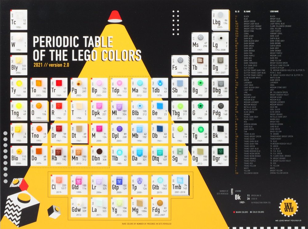
We Love What You Build’s Periodic Table of the LEGO Colors provides a non-exhaustive glimpse into the diverse selection of colors available to builders. Image via Brickset.
But as any builder—novice or expert—knows, choosing appropriate color schemes is trickier than simply picking several shades you like and throwing them together. What makes a “good” color palette, and how does it impact our builds? One combination might look perfect in a particular MOC, but it could feel completely off in another.
In practice, it all boils down to subjectivity, shaped by context, personal taste and nostalgia. So, while we, the BII team, offer guidance in this article based on our collective experience, consider this more a set of preferences rather than prescriptions.
Color Theory Basics
Given the universality of color theory, most (if not all) principles of graphic design, illustration, and art can be applied to LEGO as well. Given the breadth of the topic, we’ll get comfortable with some of the major concepts relevant to the question and article: HSV (Hue, Saturation, and Value), color symbolism, and color harmony.

Hue is essentially synonymous with what most people refer to as color. Modern color theory tends to accept three hues as “primary”: blue, red, and either yellow (in pigments) or green (on the light spectrum). Other hues exist as some combination: purple exists between blue and red, while orange exists between red and yellow, not to mention blue-green, reddish-orange, and so on. Saturation (or similarly vibrance) refers to how “pure” a color is, with a low saturation resulting in a grayish color and a high saturation resulting in a primary color. Value simply refers to how light or dark a color is. Colors with a high value appear bright, while lower values appear as darker shades (eventually reaching black at 0% value).
The LEGO color palette exists over a range of groups, typically categorized by hues, with the available colors inside the groups being separated by saturation and value. For example, Sand Green is a low-saturation color in the Green group of colors, while Dark Red is a low-value color within the Red group of colors. While the available range of colors covers the breadth of hues, some groups have more options than others at different saturations and values. This is something to keep in mind when developing color schemes, as some colors offer more options over others. Blue, for example, has plenty of highly saturated colors, while red has fewer options at high-saturation levels. However, at lower saturations and values, the opposite is true! (If you’re interested in a deeper dive into the LEGO color palette, we’d highly recommend giving Chris Clarke’s BrickNerd article a read.)

Certain color groups have advantages over others when it comes to variety, as showcased by Chris Clarke’s handy graphic!
Color symbolism refers to the feelings we associate with colors. Most colors typically have multiple feelings associated with them. Popular Western color symbolism includes:
Red: Strength, danger, passion, or anger
Orange: Creativity, adventure, or freshness.
Yellow: Happiness, energy, optimism, or caution.
Green: Vitality, nature, envy, or quality.
Blue: Peace, calm, sadness, or loyalty.
Purple: Wisdom, royalty, or luxury.
White: Simplicity, purity, innocence, or cleanliness.
Black: Formality, sophistication, death, or mystery.
Metallic: Wealth, machinery, or power.
Culture can play an important role in color symbolism as well. When building something inspired by another culture, try looking up color symbolism and popular color schemes in those cultures as well; you may learn something new and find a new color scheme to use!
Some of these colors seem somewhat contradictory; red could convey love or hate, while yellow can be welcoming or warning. This is where color harmonies can come into play; by pairing colors together, you can create a stronger image with your MOCs (as well as with shapes and textures). There are several types of color schemes you can apply to your MOCs:
Monochromatic: All colors are of the same hue. Great for peaceful and subtle designs.
Complementary: Two colors on opposite sides of the color wheel. High contrast and energy.
Analogous: Colors (typically three or more) right beside each other on the color wheel. Feels natural and harmonious.
Split Complementary: One color plus the two adjacent colors of its complementary color. Good contrast, but not as contrasting as a pure complementary color scheme.
Rectangular: Four colors that lie on the corners of an imaginary square/rectangle. Well balanced.
Triadic: Three color schemes that lie on the points of an imaginary equilateral triangle. Good mix of balance and contrast.
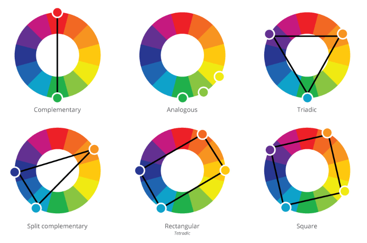
Image Courtesy of Print Peppermint
Studying Color Schemes in MOCs
Theory is great, but how can you apply these theories and choose color schemes for your MOCs? Most of the time, the decision boils down to a build’s subject matter and what it is trying to convey. To further understand these concepts from a LEGO lens, let’s take a moment to look at some iconic color schemes in MOCs and what makes them work.
“Cancer” - Dark Tan, Dark Blue, and Red/Dark Red

Sandro Quattrini’s “Cancer” was part of a Zodiac Sign collaboration within the Bioncle community. The titular zodiac sign is associated with the element water and is signified by a crab. The color scheme in Quattrini’s build reflects these ideas. Dark Blue fits well into the marine theme, but also ties equally well with the night sky, creating a satisfying double-meaning. The body consists of Dark Tan, a low-saturation yellow that successfully sells the deep-sea/space creature. Red and Dark Red make up the claws, as well as the horns, drawing inspiration from the crab reference. These three colors form a Triadic color scheme; while the MOC has clearly contrasting color sections, no single color overpowers the rest.
Medium Azure acts as a great complementary highlight to the dark blue, providing a touch of vibrance, along with the Bright Light Orange eyes and the bright red horns. Most of the MOC is comprised of low saturation or low value colors, as to be expected of a deep sea or space creature; even the vibrant Red lacks value with Quattrini’s clever photo editing. However, by including some high-saturation, high-value colors, the MOC has just the right amount of pop to catch your eye.
“Nicolo’s Caravan” - Dark Purple, Dark Azure, and Bright Light Orange

Markus Rollbühler’s “Nicolo’s Caravan” is a small yet iconic MOC portraying a painter’s caravan. The Dark Azure frame, Bright Light Orange walls, and Dark Purple roof create a Split-Complementary color scheme, creating a high-contrast home fit for a nomadic painter. Creating a balanced color scheme requires more than deciding on hues; incorporating a range of values into the color scheme is also important! Reddish Brown elements help ground the MOC and balance the high-value colors with a lower value one. Notice the backdrop also assists in balancing the composition; had it been a high-value, high-saturation color, it would be harder to focus on the build itself.
“Untitled” - Achromatic, Blue, Red
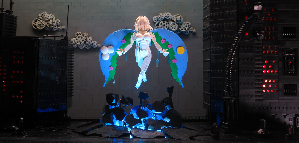
why.not? on Flickr has daringly balanced harmonies to invoke a range of feelings that support the narrative. The setting, dominated by black values, evokes a mechanical and cold atmosphere, while red is used as lights to underpin a sense of tension, danger, or warning. The central figure’s Analogous color scheme, however, creates a stark, thematic contrast. The White body both contrasts and harmonizes with saturated colours of Medium Blue, Green, and Dark Pink on the wings to highlight a sense of purity and rebirth. Additionally, the blue light from below the figure invokes a sense of peace in defiance of the red lights in the background.
Other Methods of Choosing a Color Scheme
Naturally, color theory isn’t the end-all when deciding on which shades to use. While it provides a useful base from which you can branch out to discover your own combinations, there’s no single correct answer when it comes to which color palettes work and which ones don’t.
Struggling to get started? Seasonal themes lend themselves naturally to MOCs due to their well-balanced color combinations. Springtime is associated with life, rebirth, and new beginnings; summer invokes freedom, happiness, and warmth; autumn can represent both change and harvest; and winter is often attributed to death, desolation, and loneliness. A great case study for this can be seen in the Four Season collaboration between builders Brickleas, Simon Hundsbichler, Jonas Kramm, and Ralf Langer. Each build employs a color scheme associated with its respective season, and the subject matter reflects it accordingly—Spring is represented by a build of beginnings, Summer of warmth and peace, Fall of change and declination, and Winter of desolation.

The Four Seasons collaboration—made by Brickleas, Simon Hundsbichler, Jonas Kramm and Ralf Langer—models the use of seasonal color themes to great effect.
Drawing inspiration from film stills or artworks often reveals thoughtfully composed palettes that translate well into MOCs. Kit Nugent (one of the writers of this article), for example, sought inspiration through Claude Monet’s Woman with a Parasol (1875). In addition to composition inspiration and mirroring dominant colours, he integrated highlights of Sand Green, Aqua, and Yellowish Green to create depth in the grass of his MOC.
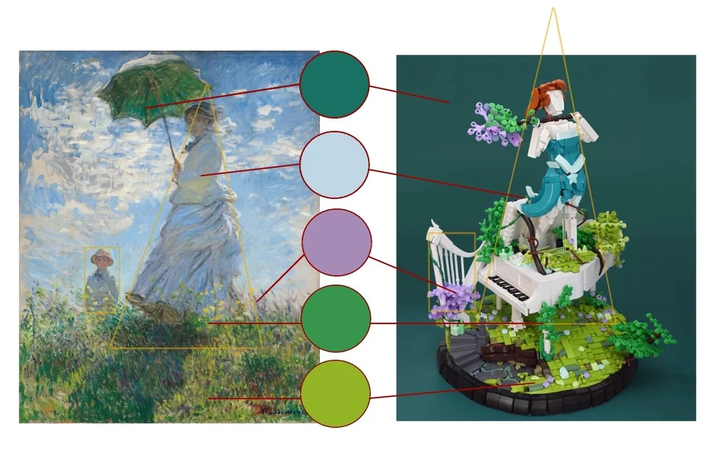
Kit Nugent’s “Sweet Sound of Blossom” drew inspiration from Claude Monet’s Women with a Parasol to establish a cool-yet-vibrant color scheme worthy of the subject material.
Pointillism is a technique in which small dots of color are used to create a complete, blended image from afar. LEGO mosaics—particularly the original line of LEGO Art sets—draw directly from this principle. At its core, it’s a different way of thinking about color—not as a continuous field of hue, but rather patterns of discrete elements that blend through perception..

Paul Signac’s Grand Canal (1905) makes use of a seemingly random assortment of colors to produce a cohesive final product. IMage via Paul Signac
On the flipside, we can also make effective use of the absence of color in MOCs. Using the greyscale is as bold a statement as using vivid colors, and can be equally handy for certain genres. Mike Doyle’s photostream provides a number of examples of the specific use of black-and-white to convey a certain ambiance. The lack of color in his large-scale buildings adds to the dilapidated, abandoned aesthetic of the run-down structures presented. It’s evident that these builds wouldn’t be nearly as striking as they are without taking the brave decision to omit color entirely from the design process.

A lack of color gives a lifeless feel to this run-down Victorian house.
(If you are curious why there is a fridge smashed through the roof, we recommend reading the story by BrickNerd’s Are Heiseldal.)
Color and Parts Usage
Of course, sometimes it’s color that shapes our creations and not the other way around. Allowing your parts selection to guide your building process is an equally valid way of producing MOCs—and it is a method that sees use in various places in the community.
Iron Builder, for instance, forces the hand of participants by giving them 100 copies of a seed part in a specific color. Season 6, Round 16 of Iron Builder centered around the handcuffs element in pearl gold—a restrictive color with a narrow parts selection, which makes it notoriously difficult to integrate seamlessly into builds. However, Justus M tailored “The Office” to fit a rustic, traditional aesthetic, which fits neatly around the pearl gold parts.
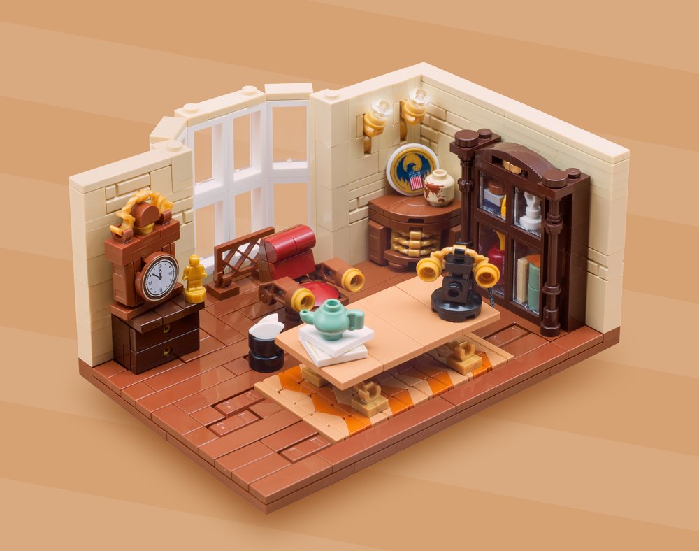
Justus’ “The Office” makes use of earthy tones to make the pearl gold seed part seem perfectly at home.
Levi (Lever Builds) of BII notes how this part and color availability has a significant impact on the final product:
“Deciding on what colour to use for a build is very important in my opinion, and as a vehicle builder, it is one of the first things I pick, after the vehicle. Working with different colours in the LEGO system comes with different challenges—that’s why I think it is really important to pick a colour that not only matches the vibe of the vehicle, but also has all the pieces that are necessary to create the MOC. Having certain pieces in a colour (like wheel arches, brackets, SNOT bricks and slopes) can be a major factor for me in deciding what colour to use for a MOC, but the limitations that come with working with a specific colour can boost creativity, and result in a better, more interesting MOC.”
“verdy_bricks is known in the LEGO car community for having built a car in almost every colour—he works with the limitations imposed by certain colours, and his MOCs are truly exceptional. I myself try to have variety in my MOCs and use different challenging colours that fit well with the vehicle I am working on. When picking a colour for a vehicle, I think it’s also important to keep in mind what colours were popular at the time and what colours the vehicle was sold in, if we are building a stock example.”
“Of course, sometimes we have no choice when building a vehicle, since some buses and trains were only sold to one company, only offered in one colour, or the vehicle was made for a specific purpose (example: construction equipment), so in those cases, we just have to find the colour in LEGO’s palette that fits the best.”
Color Theory in Practice
While topics like parts usage or collection size tend to be very LEGO-centric, color theory is rather universal, giving us a plethora of theories and inspiration to draw from. When trying to choose a color scheme for your MOC, ask yourself a couple of questions: What story or message are you trying to convey with your MOC? Can colors that connote these emotions be used to intensify the narrative?
An elegant forest queen could utilize a dark green and gold color scheme with splashes of vibrant flowers to give a sense of nature and elegance. Meanwhile, a cyberpunk rebel’s hoverbike will probably consist of a menagerie of vibrant colors on top of an old grey frame, giving the sense that it’s been cobbled together from scrap.
If you find your MOC’s colors don’t blend well together, experiment with manipulating one of the color harmonies or seek existing pieces for inspiration. Even if you finish a build and later find yourself wishing you had chosen a better color, don’t sweat it—it just means you’ve learned something! The LEGO hobby is rather forgiving when it comes to color schemes, anyway, so a sub-optimal color scheme will certainly not ruin a great MOC.
Still find yourself wanting to learn more? Check out the resources below, or join our Discord server and check out our Resource channels and ask the writers themselves!
Tips & Bricks: Introduction to Color Theory for LEGO Building
Coolors: Color Scheme Generator
BrickLink: Color Guide
Winged Canvas: 10 Color Schemes You’ve (Probably) Never Heard Of!
BrickNerd: Using Color Theory and Composition in LEGO MOCs
Written by Eann McCurdy, Kit Nugent, and Oshi White in collaboration with Pierre-Louis Maurice, Margit Bermudez, Si-nonymous, and Levi (Lever Builds).
Have a question for a future article in The Conversation Piece? Let us know in the comments below!
Do you want to help BrickNerd continue publishing articles like this one? Become a top patron like Marc & Liz Puleo, Paige Mueller, Rob Klingberg from Brickstuff, John & Joshua Hanlon from Beyond the Brick, Megan Lum, Andy Price, Lukas Kurth from StoneWars, Wayne Tyler, Dan Church, and Roxanne Baxter to show your support, get early access, exclusive swag and more.