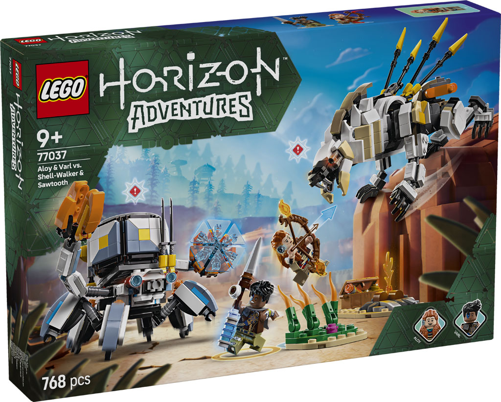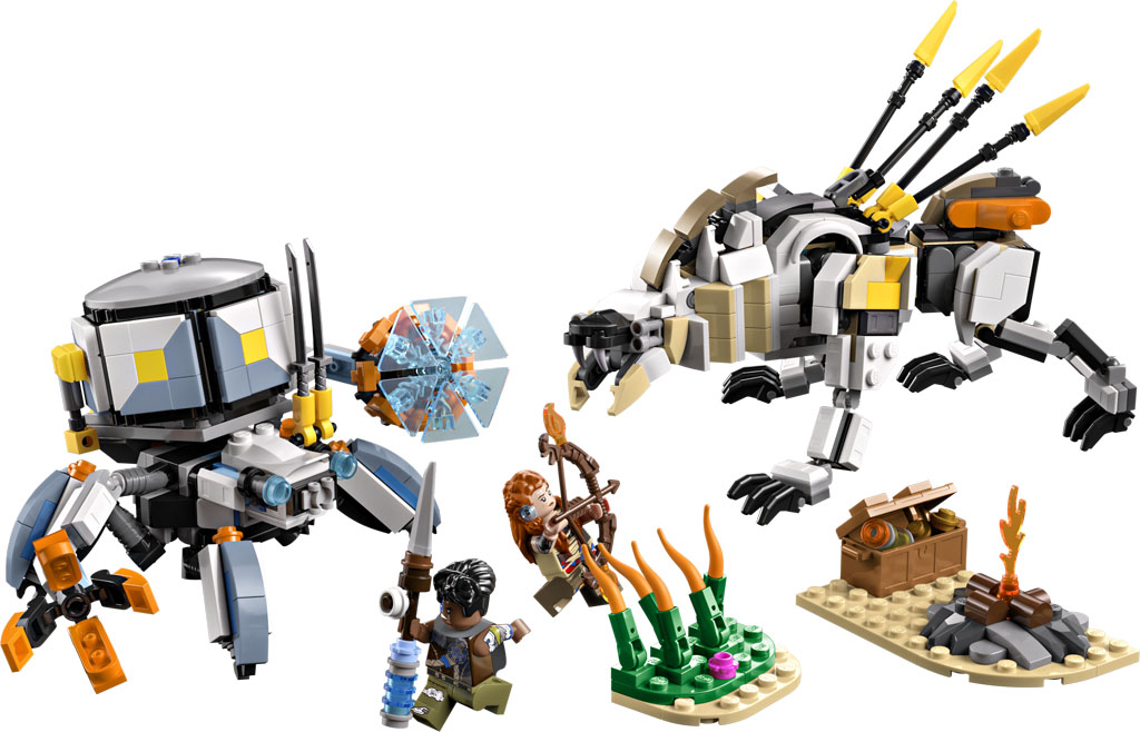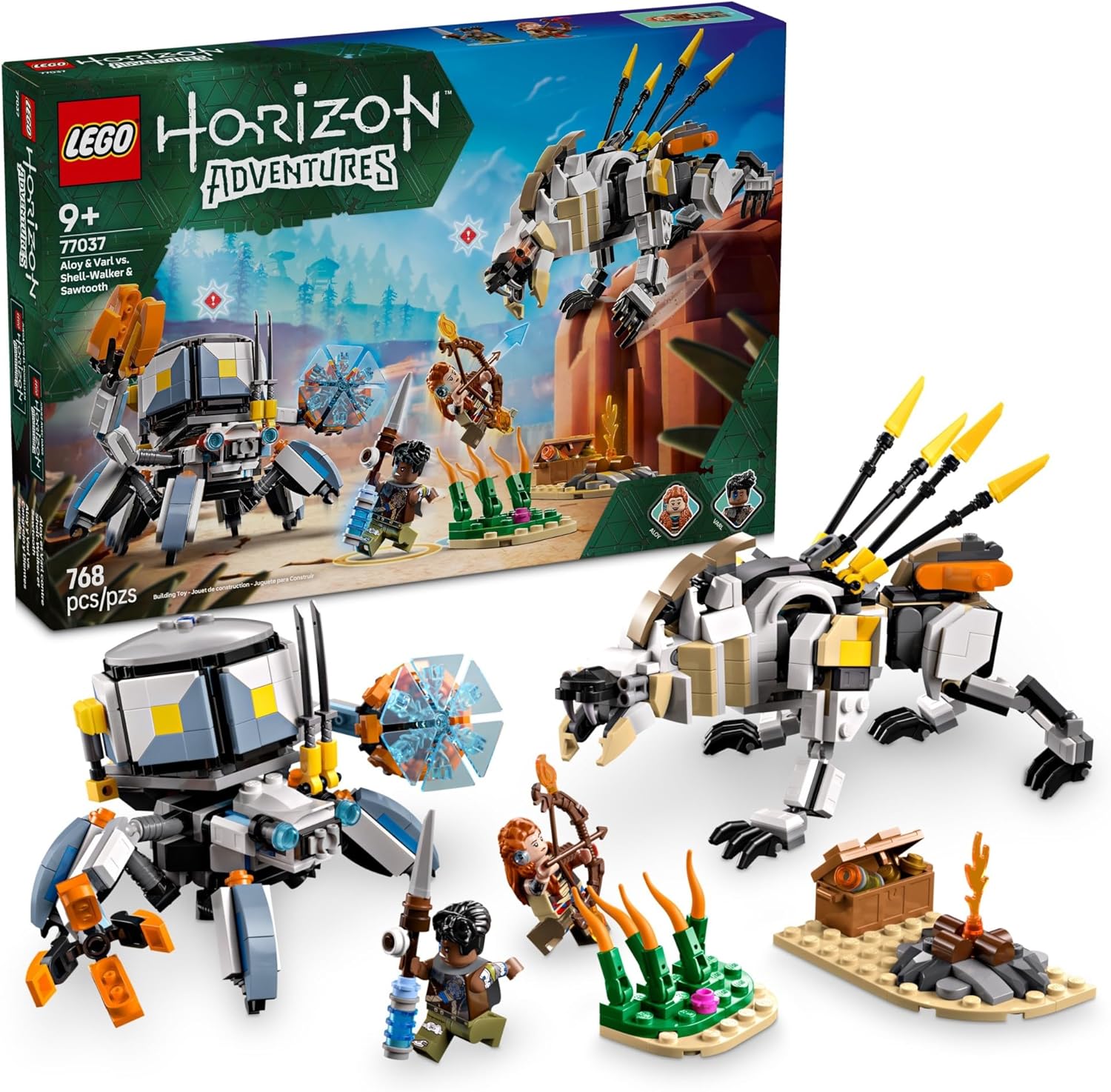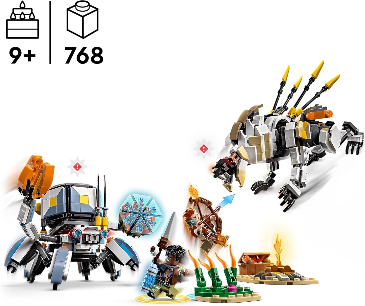
LEGO has officially announced the upcoming LEGO Horizon Adventures Aloy & Varl vs. Shell-Walker & Sawtooth (77037). Releasing on March 1, 2025, the set has 768 pieces and will retail for a very reasonable $44.99, however, you can pre-order the set starting today on the LEGO Shop. The set features an updated minifigure of Aloy and also introduces Varl as a minifigure. There’s also the two fully jointed machines of the Shell-Walker and the Sawtooth. The set follows the release of LEGO Horizon Adventures on the PlayStation 5 and Nintendo Switch a few days ago. Machine Hunters Assemble: The LEGO Group Announces LEGO Horizon Adventures Set Following Game Launch Billund, Denmark: Today, the LEGO Group announced the launch of a new playset based on recently-released video game, LEGO® Horizon Adventures. This 768-piece set allows LEGO fans to recreate the iconic adventures of Aloy and her loyal ally Varl in physical brick...